
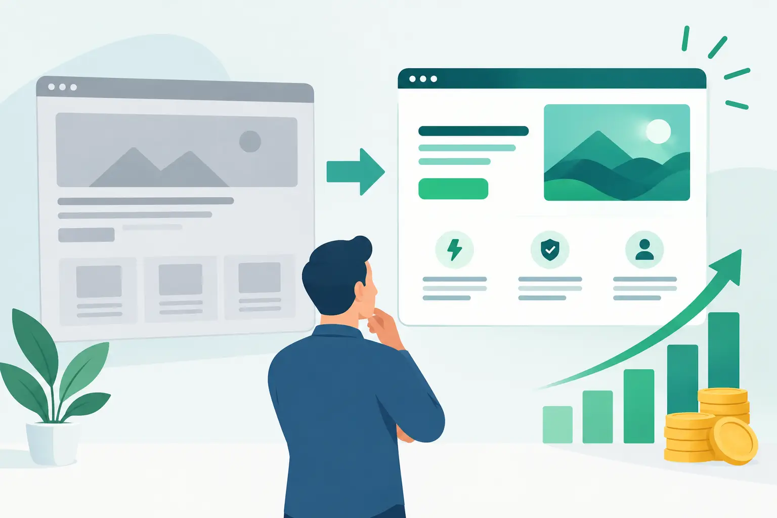
A redesign can create the illusion of progress long before it creates revenue. New visuals, smoother animations, and a cleaner homepage may win internal approval, yet conversion rates remain flat because the real barriers were never addressed. To improve conversion with redesign, the work has to begin with business behavior: where prospects hesitate, what information they cannot find, and what prevents them from taking the next step.
For founders and growth leaders, that distinction matters. A website or product experience is not a branding artifact. It is a working part of your acquisition, sales, and retention engine. The goal is not to make every screen look newer. The goal is to make high-value decisions easier for the right users.
Why Most Redesigns Fail to Move Conversion
The common failure is treating a redesign as a visual project rather than a performance initiative. Teams start with a mood board, choose a modern design system, and rebuild pages before establishing which user journeys have the greatest commercial impact.
That approach can produce a polished result while leaving the underlying friction intact. A buyer may still be unclear on what the product does. A prospect may still be asked to complete a long contact form before understanding the value. A customer may still abandon onboarding because the first meaningful action is not obvious.
Conversion issues are often caused by a mix of messaging, user experience, technical performance, and operational process. The redesign needs to account for all four.
For example, a B2B services company may see low demo requests because its homepage speaks broadly about innovation instead of naming the costly problem it solves. An ecommerce business may lose buyers because delivery information appears too late in checkout. A SaaS product may have healthy trial signups but poor activation because new users face an empty dashboard without guidance.
Each problem calls for a different redesign decision. Changing fonts will not fix unclear positioning. Adding more features to a dashboard will not improve activation. The work needs a sharper diagnosis.
Improve Conversion With Redesign Around Key Journeys
A high-performing redesign starts by identifying the journeys that matter most to the business. For many companies, that means the path from a qualified visitor to a demo request, purchase, trial signup, account activation, or repeat order. Not every page deserves the same level of attention.
Start with evidence already available in your analytics, CRM, session recordings, customer support tickets, sales calls, and user interviews. Look for the points where high-intent users pause, leave, or need human assistance. Quantitative data shows where friction occurs. Conversations with customers help explain why.
Define the conversion event and its value
“Improve conversion” is too broad to guide a redesign. Establish the specific behavior you want to improve and connect it to a business outcome.
For a startup selling enterprise software, the priority may be qualified demo requests rather than raw form completions. For a self-serve platform, it may be the percentage of trial users who complete a first project. For an established SME, it may be reducing the number of calls required to turn a lead into a customer.
This distinction protects the team from optimizing vanity metrics. A shorter form might increase submissions, but it can also reduce lead quality. More trial signups may create support costs if the onboarding experience does not help users reach value quickly. The right metric depends on the operating model, sales motion, and capacity of the business.
Map the path before designing screens
Once the target conversion is clear, map the current path step by step. Include the entry point, the information users need, the actions they take, the doubts they encounter, and the systems involved behind the scenes.
This exercise often reveals that the conversion problem is not confined to the interface. A slow-loading page can damage trust before a visitor reads the offer. A poorly configured scheduling tool can create unnecessary drop-off after someone decides to book. A handoff between marketing, sales, and product can make a promising lead feel ignored.
Design should address the experience end to end. That may mean simplifying navigation, clarifying copy, restructuring a form, improving page speed, integrating CRM data, or redesigning the post-conversion follow-up. A redesign earns its investment when it improves the full journey, not just the visible layer.
Reduce cognitive load at decision points
When a user is close to converting, every unnecessary choice creates risk. The page should answer the questions that naturally arise at that moment: What is this? Is it right for me? What happens next? What will it cost in time, money, or effort? Why should I trust this company?
The answer is rarely to add more content everywhere. It is to prioritize the right information in the right sequence. Clear value propositions, relevant proof, transparent expectations, and focused calls to action generally outperform pages that try to explain every capability at once.
For complex products, progressive disclosure is often more effective than aggressive simplification. A prospect may need technical documentation, security details, or integration information before speaking with sales. The key is to make that depth available without forcing every visitor through it. Different audiences need different levels of detail.
Design for momentum after the click
A conversion is not always the finish line. If the business depends on activation, retention, or expansion, the redesign should extend into the post-signup experience.
The first session is especially valuable. New users need a clear next action and a credible path to an early win. That can be a guided setup, a useful template, pre-populated sample data, or a short workflow that demonstrates value quickly. The correct approach depends on product complexity. Over-guiding experienced users can feel restrictive, while under-guiding new users can leave them stuck.
For service businesses, momentum may mean an immediate confirmation page that sets expectations, collects useful context, and makes it easy to schedule a meeting. It may also require fast internal routing so a qualified prospect receives a timely response. Experience design and operational execution should reinforce one another.
Build a Redesign Roadmap That Protects ROI
A full redesign does not have to mean rebuilding everything at once. In fact, a staged approach is often the better financial decision. It lowers risk, creates learning opportunities, and allows the team to focus investment where it can have the clearest impact.
Prioritize opportunities using three practical criteria: expected business value, confidence in the underlying evidence, and implementation effort. A homepage message change supported by sales-call insights may be quick to test and high impact. Replacing a core application workflow may have major upside but require deeper discovery, engineering planning, and change management.
This is where strategy and delivery need to work together. Product, design, engineering, marketing, and sales should agree on what is being improved, how success will be measured, and what constraints are non-negotiable. Budget discipline does not mean cutting corners. It means spending on the decisions most likely to change outcomes.
At Valuedriven, this is the principle behind strategy-led product work: establish the business case first, then build the smallest effective solution that can scale with evidence.
Measure Impact Without Misreading the Data
Launch day is the beginning of measurement, not proof that the redesign worked. Set a baseline before implementation and track the conversion event alongside supporting indicators such as page speed, traffic source, lead quality, activation completion, sales cycle length, and support volume.
Be careful with short-term conclusions. Conversion can shift because of seasonality, campaign changes, pricing updates, or changes in traffic quality. If volume allows, use controlled experiments for high-impact changes. If it does not, compare meaningful time periods and pair behavioral data with feedback from real users and internal teams.
Also watch for unintended consequences. A redesigned signup flow may increase completion while increasing fraud. A more prominent call to action may lift demo volume but overwhelm a small sales team with poorly qualified requests. Strong optimization considers downstream effects, not just the number at the top of the funnel.
Make the Next Improvement Easier
The best redesigns create a stronger operating system for ongoing improvement. They establish reusable components, clearer analytics, better content governance, and a shared understanding of what customers need to move forward.
That does not mean every organization needs an extensive design system or a major platform migration. A growing company may benefit more from fixing a few critical landing pages and its onboarding flow than from funding a comprehensive rebrand. A more mature business with fragmented digital experiences may need a broader foundation before incremental optimization becomes efficient.
The practical test is simple: can the team explain which customer behavior it is trying to change, why that behavior matters, and how the redesign will make the right action easier? If the answer is clear, design becomes a measurable growth investment rather than an expensive refresh.
A redesign should leave your business with more than better-looking screens. It should give customers fewer reasons to hesitate and your team better evidence for what to improve next.